Class OverlaySplitView
- All Implemented Interfaces:
Proxy,Swipeable,Accessible,Buildable,ConstraintTarget
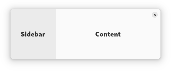
AdwOverlaySplitView has two children: sidebar and content, and displays
them side by side.
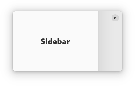
When OverlaySplitView:collapsed is set to TRUE, the sidebar is
instead shown as an overlay above the content widget.
The sidebar can be hidden or shown using the
OverlaySplitView:show-sidebar property.
Sidebar can be displayed before or after the content, this can be controlled
with the OverlaySplitView:sidebar-position property.
Collapsing the split view automatically hides the sidebar widget, and
uncollapsing it shows the sidebar. If this behavior is not desired, the
OverlaySplitView:pin-sidebar property can be used to override it.
AdwOverlaySplitView supports an edge swipe gesture for showing the sidebar,
and a swipe from the sidebar for hiding it. Gestures are only supported on
touchscreen, but not touchpad. Gestures can be controlled with the
OverlaySplitView:enable-show-gesture and
OverlaySplitView:enable-hide-gesture properties.
See also NavigationSplitView.
AdwOverlaySplitView is typically used together with an Breakpoint
setting the collapsed property to TRUE on small widths, as follows:
<object class="AdwWindow">
   <property name="default-width">800</property>
   <property name="default-height">800</property>
   <child>
     <object class="AdwBreakpoint">
       <condition>max-width: 400sp</condition>
       <setter object="split_view" property="collapsed">True</setter>
     </object>
   </child>
   <property name="content">
     <object class="AdwOverlaySplitView" id="split_view">
       <property name="sidebar">
         <!-- ... -->
       </property>
       <property name="content">
         <!-- ... -->
       </property>
     </object>
   </property>
 </object>
AdwOverlaySplitView is often used for implementing the
utility pane
pattern.
Sizing
When not collapsed, AdwOverlaySplitView changes the sidebar width
depending on its own width.
If possible, it tries to allocate a fraction of the total width, controlled
with the OverlaySplitView:sidebar-width-fraction property.
The sidebar also has minimum and maximum sizes, controlled with the
OverlaySplitView:min-sidebar-width and
OverlaySplitView:max-sidebar-width properties.
The minimum and maximum sizes are using the length unit specified with the
OverlaySplitView:sidebar-width-unit.
By default, sidebar is using 25% of the total width, with 180sp as the minimum size and 280sp as the maximum size.
When collapsed, the preferred width fraction is ignored and the sidebar uses
OverlaySplitView:max-sidebar-width when possible.
Header Bar Integration
When used inside AdwOverlaySplitView, HeaderBar will automatically
hide the window buttons in the middle.
AdwOverlaySplitView as GtkBuildable
The AdwOverlaySplitView implementation of the Buildable
interface supports setting the sidebar widget by specifying “sidebar” as the
“type” attribute of a <child> element, Specifying “content” child type or
omitting it results in setting the content widget.
CSS nodes
AdwOverlaySplitView has a single CSS node with the name
overlay-split-view.
It contains two nodes with the name widget, containing the sidebar and
content children.
When not collapsed, they have the .sidebar-view and .content-view style
classes respectively.
 overlay-split-view
 ├── widget.sidebar-pane
 │   ╰── [sidebar child]
 ╰── widget.content-pane
     ╰── [content child]
When collapsed, the one containing the sidebar child has the .background
style class and the other one has no style classes.
 overlay-split-view
 ├── widget.background
 │   ╰── [sidebar child]
 ╰── widget
     ╰── [content child]
Accessibility
AdwOverlaySplitView uses the GTK_ACCESSIBLE_ROLE_GROUP role.
- Since:
- 1.4
-
Nested Class Summary
Nested ClassesModifier and TypeClassDescriptionstatic classOverlaySplitView.Builder<B extends OverlaySplitView.Builder<B>>Inner class implementing a builder pattern to construct a GObject with properties.static classNested classes/interfaces inherited from class org.gnome.gtk.Widget
Widget.DestroyCallback, Widget.DirectionChangedCallback, Widget.HideCallback, Widget.KeynavFailedCallback, Widget.MapCallback, Widget.MnemonicActivateCallback, Widget.MoveFocusCallback, Widget.QueryTooltipCallback, Widget.RealizeCallback, Widget.ShowCallback, Widget.StateFlagsChangedCallback, Widget.UnmapCallback, Widget.UnrealizeCallback, Widget.Widget$Impl, Widget.WidgetClassNested classes/interfaces inherited from class org.gnome.gobject.InitiallyUnowned
InitiallyUnowned.InitiallyUnownedClassNested classes/interfaces inherited from class org.gnome.gobject.GObject
GObject.NotifyCallback, GObject.ObjectClassNested classes/interfaces inherited from interface org.gnome.gtk.Accessible
Accessible.Accessible$Impl, Accessible.AccessibleInterfaceNested classes/interfaces inherited from interface org.gnome.gtk.Buildable
Buildable.Buildable$Impl, Buildable.BuildableIfaceNested classes/interfaces inherited from interface org.gnome.gtk.ConstraintTarget
ConstraintTarget.ConstraintTarget$Impl, ConstraintTarget.ConstraintTargetInterfaceNested classes/interfaces inherited from interface org.gnome.adw.Swipeable
Swipeable.Swipeable$Impl, Swipeable.SwipeableInterface -
Field Summary
Fields inherited from class io.github.jwharm.javagi.base.ProxyInstance
address -
Constructor Summary
ConstructorsConstructorDescriptionCreates a new OverlaySplitView.OverlaySplitView(MemorySegment address) Create a OverlaySplitView proxy instance for the provided memory address. -
Method Summary
Modifier and TypeMethodDescriptionprotected OverlaySplitViewasParent()Returns this instance as if it were its parent type.static OverlaySplitView.Builder<? extends OverlaySplitView.Builder> builder()AOverlaySplitView.Builderobject constructs aOverlaySplitViewwith the specified properties.booleanGets whether this OverlaySplitView is collapsed.Gets the content widget for this OverlaySplitView.booleanGets whether this OverlaySplitView can be closed with a swipe gesture.booleanGets whether this OverlaySplitView can be opened with an edge swipe gesture.doubleGets the maximum sidebar width for this OverlaySplitView.doubleGets the minimum sidebar width for this OverlaySplitView.booleanGets whether the sidebar widget is pinned for this OverlaySplitView.booleanGets whether the sidebar widget is shown for this OverlaySplitView.Gets the sidebar widget for this OverlaySplitView.Gets the sidebar position for this OverlaySplitView.doubleGets the preferred sidebar width fraction for this OverlaySplitView.Gets the length unit for minimum and maximum sidebar widths.static TypegetType()Get the GType of the OverlaySplitView classvoidsetCollapsed(boolean collapsed) Sets whether this OverlaySplitView view is collapsed.voidsetContent(@Nullable Widget content) Sets the content widget for this OverlaySplitView.voidsetEnableHideGesture(boolean enableHideGesture) Sets whether this OverlaySplitView can be closed with a swipe gesture.voidsetEnableShowGesture(boolean enableShowGesture) Sets whether this OverlaySplitView can be opened with an edge swipe gesture.voidsetMaxSidebarWidth(double width) Sets the maximum sidebar width for this OverlaySplitView.voidsetMinSidebarWidth(double width) Sets the minimum sidebar width for this OverlaySplitView.voidsetPinSidebar(boolean pinSidebar) Sets whether the sidebar widget is pinned for this OverlaySplitView.voidsetShowSidebar(boolean showSidebar) Sets whether the sidebar widget is shown for this OverlaySplitView.voidsetSidebar(@Nullable Widget sidebar) Sets the sidebar widget for this OverlaySplitView.voidsetSidebarPosition(PackType position) Sets the sidebar position for this OverlaySplitView.voidsetSidebarWidthFraction(double fraction) Sets the preferred sidebar width as a fraction of the total width of this OverlaySplitView.voidSets the length unit for minimum and maximum sidebar widths.Methods inherited from class org.gnome.gtk.Widget
actionSetEnabled, activateActionIfExists, activateDefault, activateWidget, addController, addCssClass, addMnemonicLabel, addTickCallback, allocate, childFocus, computeBounds, computeExpand, computeExpand, computePoint, computeTransform, contains, createPangoContext, createPangoLayout, cssChanged, directionChanged, disposeTemplate, dragCheckThreshold, emitDestroy, emitDirectionChanged, emitHide, emitKeynavFailed, emitMap, emitMnemonicActivate, emitMoveFocus, emitQueryTooltip, emitRealize, emitShow, emitStateFlagsChanged, emitUnmap, emitUnrealize, errorBell, focus, getAllocatedBaseline, getAllocatedHeight, getAllocatedWidth, getAllocation, getAncestor, getBaseline, getCanFocus, getCanTarget, getChildVisible, getClipboard, getColor, getCssClasses, getCssName, getCursor, getDefaultDirection, getDirection, getDisplay, getFirstChild, getFocusable, getFocusChild, getFocusOnClick, getFontMap, getFontOptions, getFrameClock, getHalign, getHasTooltip, getHeight, getHexpand, getHexpandSet, getLastChild, getLayoutManager, getLimitEvents, getMapped, getMarginBottom, getMarginEnd, getMarginStart, getMarginTop, getMemoryLayout, getName, getNative, getNextSibling, getOpacity, getOverflow, getPangoContext, getParent, getPreferredSize, getPrevSibling, getPrimaryClipboard, getRealized, getReceivesDefault, getRequestMode, getRoot, getScaleFactor, getSensitive, getSettings, getSize, getSizeRequest, getStateFlags, getStyleContext, getTemplateChild, getTooltipMarkup, getTooltipText, getValign, getVexpand, getVexpandSet, getVisible, getWidth, grabFocus, hasCssClass, hasDefault, hasFocus, hasVisibleFocus, hide, inDestruction, initTemplate, insertActionGroup, insertAfter, insertBefore, isAncestor, isDrawable, isFocus, isSensitive, isVisible, keynavFailed, listMnemonicLabels, map, measure, mnemonicActivate, moveFocus, observeChildren, observeControllers, onDestroy, onDirectionChanged, onHide, onKeynavFailed, onMap, onMnemonicActivate, onMoveFocus, onQueryTooltip, onRealize, onShow, onStateFlagsChanged, onUnmap, onUnrealize, pick, pick, queryTooltip, queueAllocate, queueDraw, queueResize, realize, removeController, removeCssClass, removeMnemonicLabel, removeTickCallback, root, setCanFocus, setCanTarget, setChildVisible, setCssClasses, setCursor, setCursorFromName, setDefaultDirection, setDirection, setFocusable, setFocusChild, setFocusOnClick, setFontMap, setFontOptions, setHalign, setHasTooltip, setHexpand, setHexpandSet, setLayoutManager, setLimitEvents, setMarginBottom, setMarginEnd, setMarginStart, setMarginTop, setName, setOpacity, setOverflow, setParent, setReceivesDefault, setSensitive, setSizeRequest, setStateFlags, setStateFlags, setTooltipMarkup, setTooltipText, setValign, setVexpand, setVexpandSet, setVisible, shouldLayout, show, sizeAllocate, sizeAllocate, snapshot, snapshotChild, stateFlagsChanged, systemSettingChanged, translateCoordinates, triggerTooltipQuery, unmap, unparent, unrealize, unroot, unsetStateFlags, unsetStateFlagsMethods inherited from class org.gnome.gobject.GObject
addToggleRef, addWeakPointer, bindProperty, bindProperty, bindProperty, bindPropertyFull, bindPropertyFull, bindPropertyWithClosures, bindPropertyWithClosures, compatControl, connect, connect, connect, constructed, disconnect, dispatchPropertiesChanged, dispose, dupData, dupQdata, emit, emitNotify, finalize_, forceFloating, freezeNotify, get, getData, getProperty, getProperty, getProperty, getQdata, getv, interfaceFindProperty, interfaceInstallProperty, interfaceListProperties, isFloating, newInstance, newInstance, newv, notify_, notify_, notifyByPspec, onNotify, ref, refSink, removeToggleRef, removeWeakPointer, replaceData, replaceQdata, runDispose, set, setData, setDataFull, setProperty, setProperty, setProperty, setQdata, setQdataFull, setv, stealData, stealQdata, takeRef, thawNotify, unref, watchClosure, weakRef, weakUnref, withPropertiesMethods inherited from class org.gnome.gobject.TypeInstance
callParent, callParent, getPrivate, readGClass, writeGClassMethods inherited from class io.github.jwharm.javagi.base.ProxyInstance
equals, handle, hashCodeMethods inherited from class java.lang.Object
clone, finalize, getClass, notify, notifyAll, toString, wait, wait, waitMethods inherited from interface org.gnome.gtk.Accessible
announce, getAccessibleParent, getAccessibleRole, getAtContext, getBounds, getFirstAccessibleChild, getNextAccessibleSibling, getPlatformState, resetProperty, resetRelation, resetState, setAccessibleParent, updateNextAccessibleSibling, updatePlatformState, updateProperty, updateRelation, updateStateMethods inherited from interface org.gnome.gtk.Buildable
getBuildableIdMethods inherited from interface org.gnome.adw.Swipeable
getCancelProgress, getDistance, getProgress, getSnapPoints, getSwipeArea
-
Constructor Details
-
OverlaySplitView
Create a OverlaySplitView proxy instance for the provided memory address.- Parameters:
address- the memory address of the native object
-
OverlaySplitView
public OverlaySplitView()Creates a new OverlaySplitView.
-
-
Method Details
-
getType
-
asParent
Returns this instance as if it were its parent type. This is mostly synonymous to the Javasuperkeyword, but will set the native typeclass function pointers to the parent type. When overriding a native virtual method in Java, "chaining up" withsuper.methodName()doesn't work, because it invokes the overridden function pointer again. To chain up, callasParent().methodName(). This will call the native function pointer of this virtual method in the typeclass of the parent type. -
getCollapsed
public boolean getCollapsed()Gets whether this OverlaySplitView is collapsed.- Returns:
- whether this OverlaySplitView is collapsed
- Since:
- 1.4
-
getContent
Gets the content widget for this OverlaySplitView.- Returns:
- the content widget for this OverlaySplitView
- Since:
- 1.4
-
getEnableHideGesture
public boolean getEnableHideGesture()Gets whether this OverlaySplitView can be closed with a swipe gesture.- Returns:
TRUEif this OverlaySplitView can be closed with a swipe gesture- Since:
- 1.4
-
getEnableShowGesture
public boolean getEnableShowGesture()Gets whether this OverlaySplitView can be opened with an edge swipe gesture.- Returns:
TRUEif this OverlaySplitView can be opened with a swipe gesture- Since:
- 1.4
-
getMaxSidebarWidth
public double getMaxSidebarWidth()Gets the maximum sidebar width for this OverlaySplitView.- Returns:
- the maximum width
- Since:
- 1.4
-
getMinSidebarWidth
public double getMinSidebarWidth()Gets the minimum sidebar width for this OverlaySplitView.- Returns:
- the minimum width
- Since:
- 1.4
-
getPinSidebar
public boolean getPinSidebar()Gets whether the sidebar widget is pinned for this OverlaySplitView.- Returns:
- whether if the sidebar widget is pinned
- Since:
- 1.4
-
getShowSidebar
public boolean getShowSidebar()Gets whether the sidebar widget is shown for this OverlaySplitView.- Returns:
TRUEif the sidebar widget is shown- Since:
- 1.4
-
getSidebar
Gets the sidebar widget for this OverlaySplitView.- Returns:
- the sidebar widget for this OverlaySplitView
- Since:
- 1.4
-
getSidebarPosition
Gets the sidebar position for this OverlaySplitView.- Returns:
- the sidebar position for this OverlaySplitView
- Since:
- 1.4
-
getSidebarWidthFraction
public double getSidebarWidthFraction()Gets the preferred sidebar width fraction for this OverlaySplitView.- Returns:
- the preferred width fraction
- Since:
- 1.4
-
getSidebarWidthUnit
Gets the length unit for minimum and maximum sidebar widths.- Returns:
- the length unit
- Since:
- 1.4
-
setCollapsed
public void setCollapsed(boolean collapsed) Sets whether this OverlaySplitView view is collapsed.When collapsed, the sidebar widget is presented as an overlay above the content widget, otherwise they are displayed side by side.
- Parameters:
collapsed- whether this OverlaySplitView is collapsed- Since:
- 1.4
-
setContent
Sets the content widget for this OverlaySplitView.- Parameters:
content- the content widget- Since:
- 1.4
-
setEnableHideGesture
public void setEnableHideGesture(boolean enableHideGesture) Sets whether this OverlaySplitView can be closed with a swipe gesture.Only touchscreen swipes are supported.
- Parameters:
enableHideGesture- whether this OverlaySplitView can be closed with a swipe gesture- Since:
- 1.4
-
setEnableShowGesture
public void setEnableShowGesture(boolean enableShowGesture) Sets whether this OverlaySplitView can be opened with an edge swipe gesture.Only touchscreen swipes are supported.
- Parameters:
enableShowGesture- whether this OverlaySplitView can be opened with a swipe gesture- Since:
- 1.4
-
setMaxSidebarWidth
public void setMaxSidebarWidth(double width) Sets the maximum sidebar width for this OverlaySplitView.Maximum width is affected by
OverlaySplitView:sidebar-width-unit.The sidebar widget can still be allocated with larger width if its own minimum width exceeds it.
- Parameters:
width- the maximum width- Since:
- 1.4
-
setMinSidebarWidth
public void setMinSidebarWidth(double width) Sets the minimum sidebar width for this OverlaySplitView.Minimum width is affected by
OverlaySplitView:sidebar-width-unit.The sidebar widget can still be allocated with larger width if its own minimum width exceeds it.
- Parameters:
width- the minimum width- Since:
- 1.4
-
setPinSidebar
public void setPinSidebar(boolean pinSidebar) Sets whether the sidebar widget is pinned for this OverlaySplitView.By default, collapsing this OverlaySplitView automatically hides the sidebar widget, and uncollapsing it shows the sidebar. If set to
TRUE, sidebar visibility never changes on its own.- Parameters:
pinSidebar- whether to pin the sidebar widget- Since:
- 1.4
-
setShowSidebar
public void setShowSidebar(boolean showSidebar) Sets whether the sidebar widget is shown for this OverlaySplitView.- Parameters:
showSidebar- whether to show the sidebar widget- Since:
- 1.4
-
setSidebar
Sets the sidebar widget for this OverlaySplitView.- Parameters:
sidebar- the sidebar widget- Since:
- 1.4
-
setSidebarPosition
Sets the sidebar position for this OverlaySplitView.If it's set to
GTK_PACK_START, the sidebar is displayed before the content, ifGTK_PACK_END, it's displayed after the content.- Parameters:
position- the new position- Since:
- 1.4
-
setSidebarWidthFraction
public void setSidebarWidthFraction(double fraction) Sets the preferred sidebar width as a fraction of the total width of this OverlaySplitView.The preferred width is additionally limited by
OverlaySplitView:min-sidebar-widthandOverlaySplitView:max-sidebar-width.The sidebar widget can be allocated with larger width if its own minimum width exceeds the preferred width.
- Parameters:
fraction- the preferred width fraction- Since:
- 1.4
-
setSidebarWidthUnit
Sets the length unit for minimum and maximum sidebar widths.See
OverlaySplitView:min-sidebar-widthandOverlaySplitView:max-sidebar-width.- Parameters:
unit- the length unit- Since:
- 1.4
-
builder
AOverlaySplitView.Builderobject constructs aOverlaySplitViewwith the specified properties. Use the variousset...()methods to set properties, and finish construction withOverlaySplitView.Builder.build().
-